6. Theming & Customization
Theming makes it possible to adapt the look of inorigo® applications, workbench and the portal to a customer’s brand by changing visual aspects like colors and logotype.
Visual familiarity supports adoption. When inorigo® reflects a customer’s brand, users more easily connect the applications to their organization, making the environment feel like a natural part of their daily work.
Consult the client’s designer or brand expert to access assets and brand guidelines – and ensure the customization aligns with those standards.
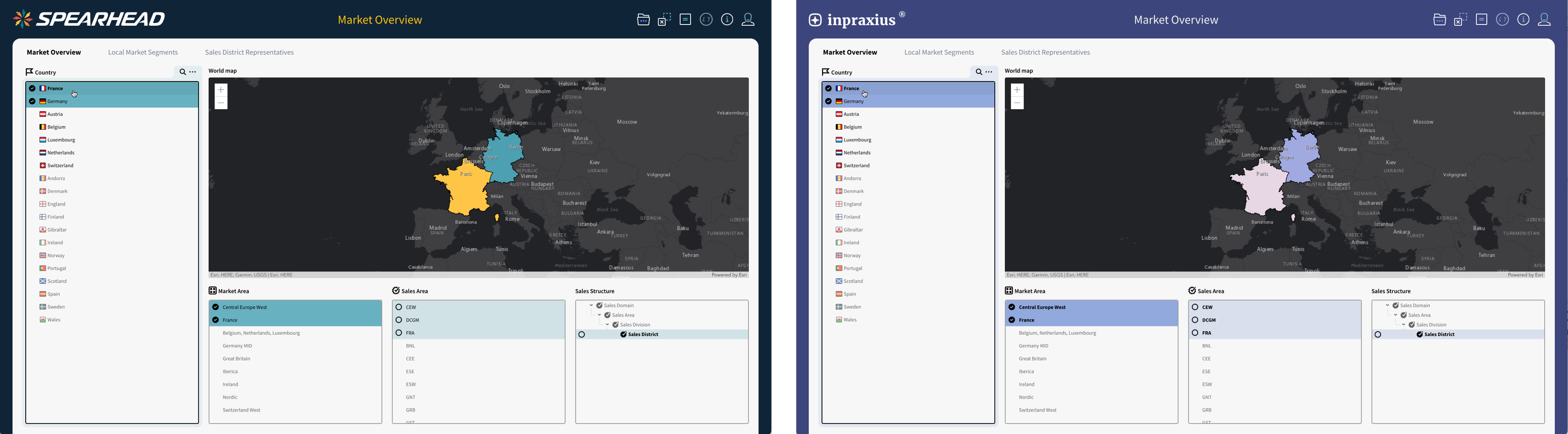
The same inorigo® application with two different themes and branding
General Guidelines
Follow the basic principles
Apply theming with the principle Customize Appropriately in mind. All customization should support usability and clarity first. See also Design Principles.
Don’t mix & match
Avoid applying different themes across applications within the same installation. The theme should be global and consistent. While multiple themes are technically possible, they are not recommended.
Don’t wing it
Never improvise with colors or logotypes. Always consult the customer’s brand guidelines to confirm which elements are approved and how they should be used.
Prioritize usability over aesthetics
Ensure applications are pleasant and functional for daily users, even if this means not being fully on-brand.
Don't let branding override legibility or accessibility. When conflicts occur, usability always takes precedence
Theming
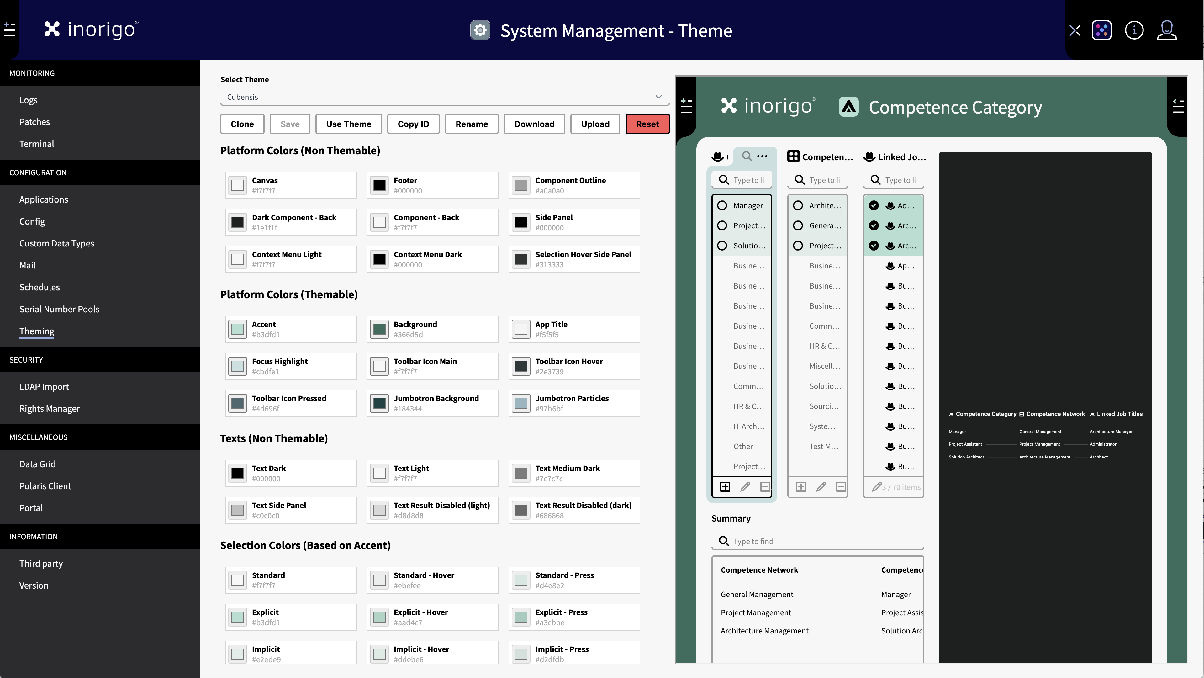
The theme editor allow you to test the colors on the fly.
Theming is managed through System Management in the Workbench.
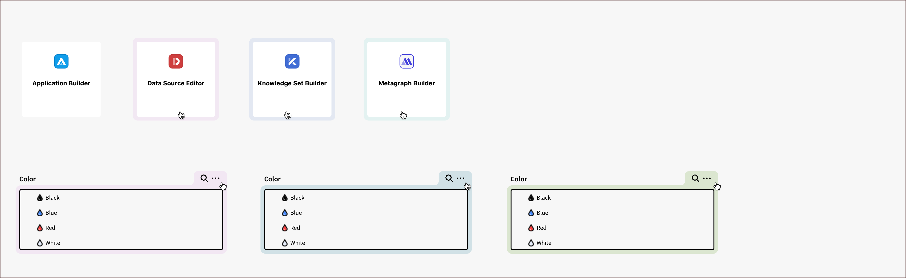
There are seven main colors that can be customized.
Accent Color
Base the accent color on the customer’s primary or secondary brand color when possible. Adjust the lightness if needed to maintain legibility. The accent color should not be too dark or too bright.
The accent color is used to generate selection and hover states throughout applications. Always verify contrast and accessibility, as this color is commonly paired with dark text in lists.
The different highlight colors are all derived from the theme's accent color.
Once the accent color is set, the Application Builder automatically generates the different hues required for list colors.
Don't: Avoid monochrome, neutral colors like grey, black or white. Grey signals a disabled state or "non-clickable". Black and white will not work with legibility.
Background
The background color applies to the Portik that surrounds the Application and the Workbench. Toolbar icons are displayed on this color, alongside the brand logotype.
- Ensure the background color is approved for use with the logotype in the customer’s brand guidelines.
- Only customize the background color if the logotype is also updated.
- For best results, use a light or dark color that provides high contrast.
App Title
The app title text must be clearly readable on the background. If in doubt, verify contrast using a tool such as contrastchecker.com.
- Prefer monochrome colors (black, white, or grey) for best readability.
- Toolbar icons use the accent color in addition to their main monochrome color.
- As a rule of thumb, use a monochrome color for the app title that matches the toolbar icons.
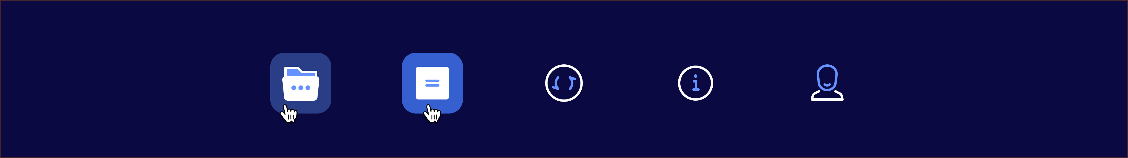
Toolbar Icons
Toolbar icons use four colors:
- Accent – applied to the icon. Typically the brand main color (See Accent Color)
- Toolbar Icon Main – base color of the icon.
- Toolbar Icon Hover – background plate when the mouse hovers over the icon.
- Toolbar Icon Pressed – background plate when the icon is selected.
Toolbar Icon Main
Adjust this color after setting the background to ensure the icon remains visible. Monochrome colors (black, grey, or white) usually provide the best contrast.
Toolbar Icon Hover
Set this color so the hover background plate works with both the background and the icon. Adjust as needed to maintain visibility and balance.
Toolbar Icon Pressed
Set this color so the pressed background plate works with both the background and the icon. Ensure it is distinct from the hover state for clear feedback.
Focus Highlight
The focus highlight is used to support navigation in applications and the Workbench. It marks components in their hover state.
Examples of focus highlights
- Base the focus highlight on a variant of the accent color or another contrasting color.
- Use a very light and soft tone for best results.
- A common approach (as in the inorigo® default theme) is to take the accent or background color, lower the opacity to around 10%, sample the result, and use it as the focus color.
- Brand secondary colors may also be suitable.
- Don’t use black or white as focus colors.
Extended Palette
The extended palette consists of 12 colors primarily used for graphs. Customizing the extended palette should not be a goal in itself—avoid changes unless there is a clear need.
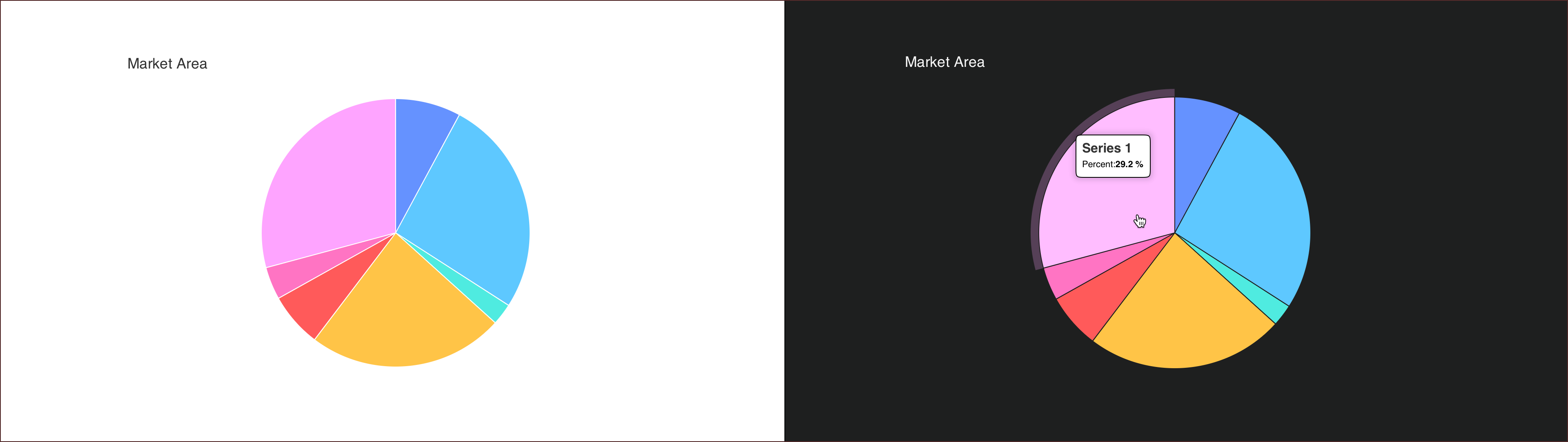
Example of the default chart colors in pie charts with light and dark backround.
- Colors must work on both light and dark backgrounds. Do not use shades that are too dark or too light.
- Each color should be clearly distinguishable from the others. The more colors included, the harder they are to differentiate.
- Consider accessibility: a significant share of the population is color blind, which further limits the effective use of the palette.
Portal Theming
The Portal can be customized separately. This is done through the Admin page (/admin) of the portal.
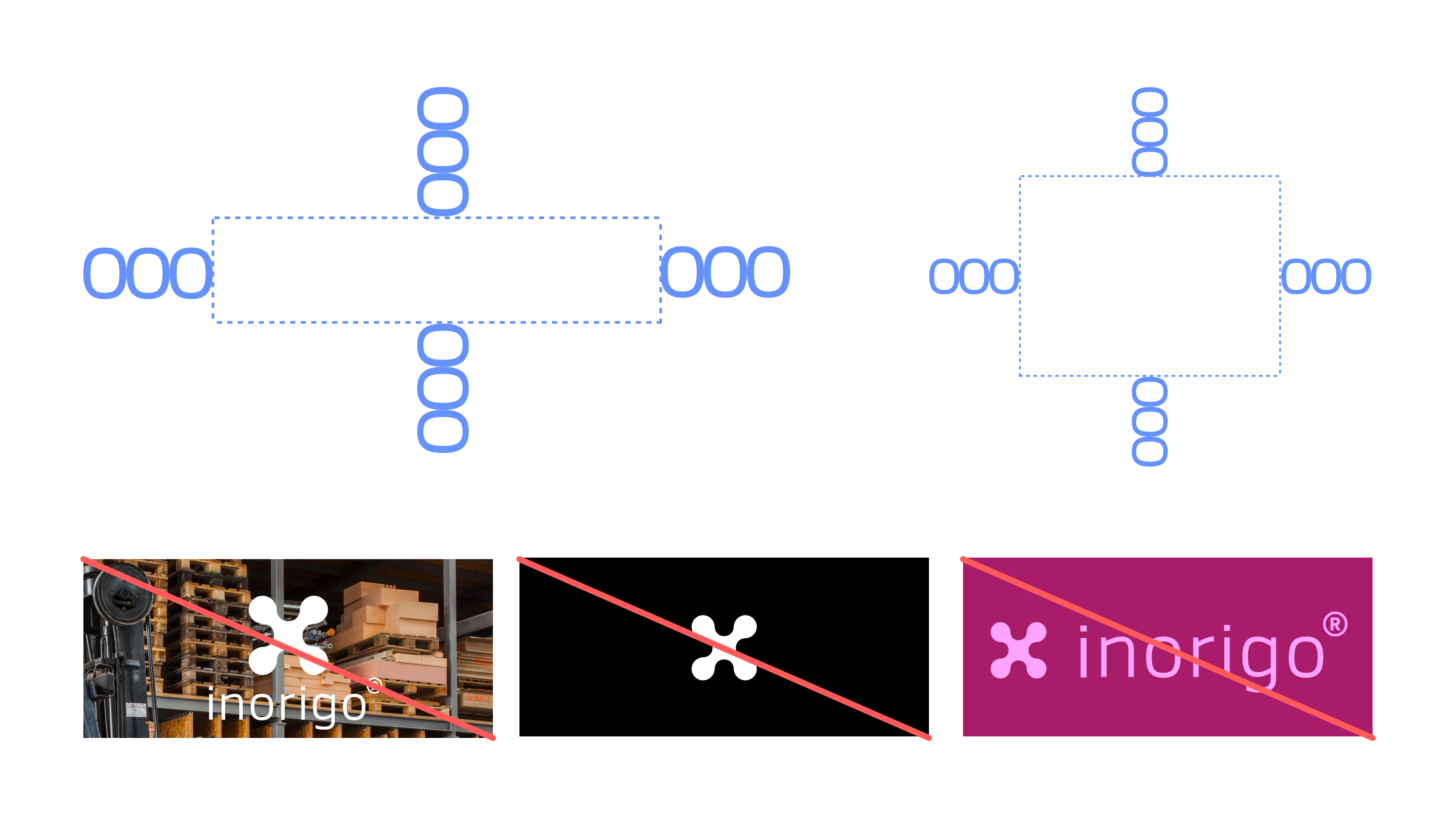
Logotype
You can upload a custom logotype, this will replace the default inorigo® logo in the top left corner.
The logo should be an image in .png format with a max size 500kb.
For best result the logotype should have 192px height including vertical clear space.
The logo will appear on the Portal's Main Background (also set in the Portal theme settings)
Make sure that you consult the brand guidelines, or responsible brand person to ensure that the logo has sufficient white space and complies to rules regarding size and colors.
The logotype appears in the header of the Portal and in any applications opened from the Portal (The default setting). For details on adding applications to the Portal, see the Portal documentation.
Examples of white space requirements and logo "Dont's" from inorigo's brand guidelines.
Jumbotron
At the top of the Portal, there is an area reserved for a large image or animation called the Jumbotron.
The portal's Search bar appears on top of the Jumbotron.
By default, this area displays a dynamic particle animation, which can be adjusted to match the Portal’s colors.
Particles Type
From here you can choose between different types of animation
Background Color
Sets the color that the particles appear on.
Particle Color
Sets the color of the particles.
Image
Replaces the default Jumbotron animation with a custom image.
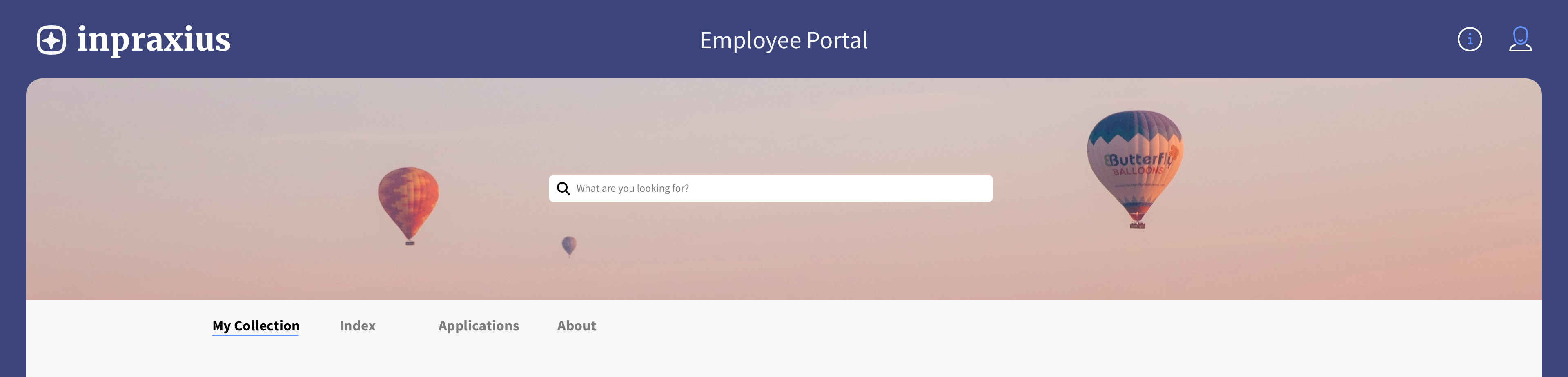
Example of a good Jumbotron image thats isn't affected by the motive being cropped or blocked.
Jumbotron Image Guidelines
- Use JPG or PNG format, maximum size 500 KB.
- Image dimensions should be 1920 × 320 px.
- The image will be cropped depending on the user’s browser and screen resolution.
- Prefer abstract or landscape motifs.
- Avoid images with people or fine details, as these may be cropped or obscured by the Portal’s search field.
Main Colors
There's four main colors to be customized.
Main Background
The color in the header on which the logo, icons and title appear on.
Main Background Text
This is the text color of the title of the portal and any application that is open from the portal.
Main Content
The portal content background color defines the main content area. Keep this color light or white-ish to ensure best legibility.
Main Content Text
The color of the text in the Main Content Area. Keep this color black or dark for good contrast and legibility.
Categories
The Portal's Index page lists all content in the portal and can be filtered on different categories. It is possible to customize the state of a category when it is selected. When unselected the category appears white with black text.
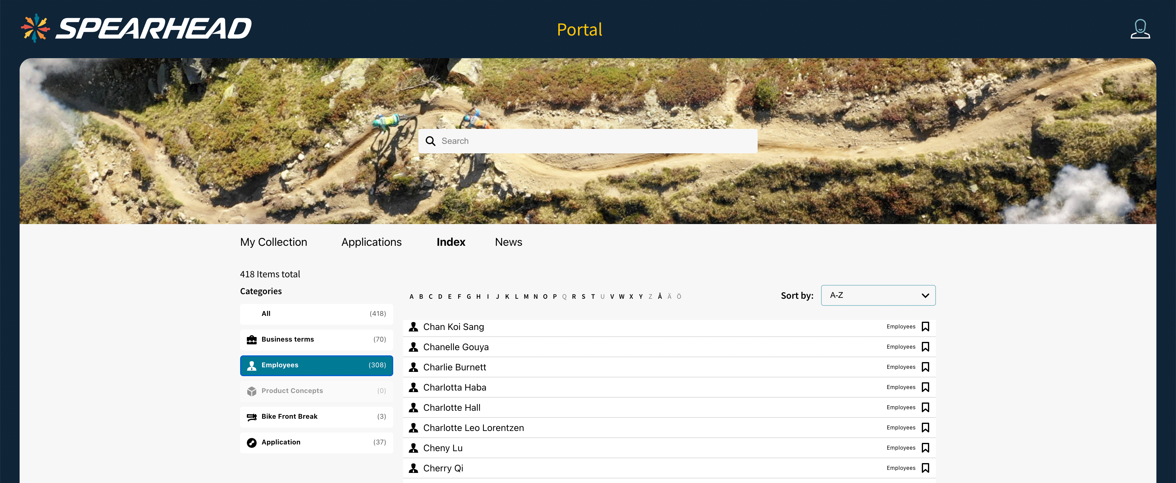
Example of the index page, filtered on Employees.
Selected Background
The background color of the selected category. Make sure that the color has good contrast to the Selected Text.
Selected Text
The color of the text of the selected category. Make sure that the color has good contrast to the Selected Background.
Force Colorless Icons
When enabled the original color of the category icons will be overwritten and the icon will be automatically set as black or white, depending on the category background color.
© 2025 Inorigo AB. All rights reserved.